本节介绍假设检验和方差分析中可能遇到的数据可视化方法。假设检验讨论单个总体和两个总体的均值比较问题,方差分析则讨论多个总体的均值比较问题。如果样本数据满足参数分析的要求,如满足正态性、方差齐性等要求,使用参数分析方法;如果不满足,可使用非参数的方法。[大谦Excel,dqexcel点com]
配对图
配对图如图5-26所示,可以有不同的样式。图中很多直线段,它们是两个样本中配对数据点相连得到的。使用配对图可以用图形直观地表现两个样本数据个别数据之间和总体数据之间的差异情况。
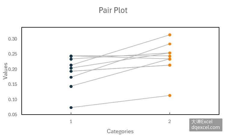
图5-26 配对图
用Python xlwings自己绘制配对图,首先通过筛选得到两个分组的数据,然后绘制两组数据中配对点的连线,最后绘制左侧和右侧的散点。完整代码见:Samples->ch08 统计图表->24 配对图->py.py。
code.vba
Sub Test()
  Dim intI As Integer
  Dim intJ As Integer
  Dim D1() As Double
  Dim D2() As Double
  Dim DX1() As Double
  Dim DX2() As Double
  Dim intCount(1 To 6) As Integer
  For intI = 1 To 6
    intCount(intI) = 0
  Next
  Dim data()
  data = Range("A2:B21").Value
  For intJ = 1 To 20
    If data(intJ, 2) = 1 Then
      intCount(1) = intCount(1) + 1
      ReDim Preserve D1(intCount(1) - 1)
      ReDim Preserve DX1(intCount(1) - 1)
      DX1(intCount(1) - 1) = 1
      D1(intCount(1) - 1) = data(intJ, 1)
    ElseIf data(intJ, 2) = 2 Then
      intCount(2) = intCount(2) + 1
      ReDim Preserve D2(intCount(2) - 1)
      ReDim Preserve DX2(intCount(2) - 1)
      DX2(intCount(2) - 1) = 2
      D2(intCount(2) - 1) = data(intJ, 1)
    End If
  Next

  Dim shp As Shape
  Dim cht As Chart
  Set shp = ActiveSheet.Shapes.AddChart2()
  Set cht = shp.Chart
  cht.ChartType = xlXYScatter
  Dim ax1 As Axis
  Set ax1 = cht.Axes(1)
  Dim ax2 As Axis
  Set ax2 = cht.Axes(2)
  ax1.MinimumScale = 0
  ax1.MaximumScale = 3
  ax2.MinimumScale = 0
  ax2.MaximumScale = 0.35
  cht.SeriesCollection(1).Delete
  cht.Legend.Delete

  SetStyle cht

  Dim bx As Double
  Dim by As Double
  Dim ex As Double
  Dim ey As Double
  For intI = 1 To 10
    bx = ShapeX(cht, CDbl(1))
    ex = ShapeX(cht, CDbl(2))
    by = ShapeY(cht, CDbl(D1(intI - 1)))
    ey = ShapeY(cht, CDbl(D2(intI - 1)))
    Set shp = cht.Shapes.AddLine(bx, by, ex, ey)
    shp.Line.Weight = 1
    shp.Line.ForeColor.RGB = RGB(180, 180, 180)
  Next

  Dim shp2 As Shape
  For intI = 1 To 10
    bx = ShapeX(cht, CDbl(1))
    by = ShapeY(cht, CDbl(D1(intI - 1)))
    ex = cht.PlotArea.InsideWidth / (cht.Axes(1).MaximumScale - _
          cht.Axes(1).MinimumScale) * 0.02
    ey = ex
    Set shp2 = cht.Shapes.AddShape(msoShape5pointStar, bx, by, ex, ey)
  Next

  Dim shp3 As Shape
  For intI = 1 To 10
    bx = ShapeX(cht, CDbl(2))
    by = ShapeY(cht, CDbl(D2(intI - 1)))
    ex = cht.PlotArea.InsideWidth / (cht.Axes(1).MaximumScale - _
          cht.Axes(1).MinimumScale) * 0.02
    ey = ex
    Set shp3 = cht.Shapes.AddShape(msoShape4pointStar, bx, by, ex, ey)
    shp3.Fill.ForeColor.RGB = RGB(255, 128, 0)
  Next

  cht.SeriesCollection.NewSeries
  Dim intN As Integer
  intN = cht.SeriesCollection.Count
  cht.FullSeriesCollection(intN).ChartType = xlXYScatterLinesNoMarkers
  cht.FullSeriesCollection(intN).XValues = Array(0, 3)
  cht.FullSeriesCollection(intN).Values = Array(0, 0)
  cht.FullSeriesCollection(intN).Format.Line.ForeColor.RGB = RGB(0, 0, 0)
  cht.FullSeriesCollection(intN).Format.Line.Weight = 1
End Sub
运行代码生成类似图5-26的配对图。
误差柱状图叠加配对图
误差柱状图叠加配对图的效果如图5-28所示,用误差柱状图表现两组数据之间总的差异,用配对图表现各配对数据个体之间的差异。
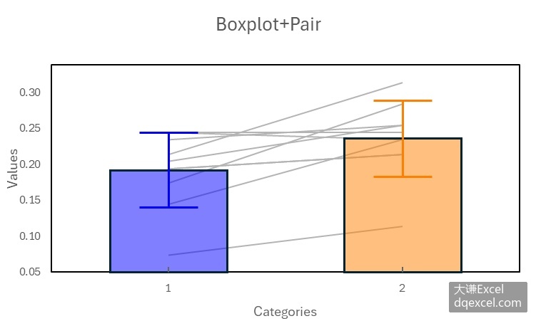
图5-28 误差柱状图叠加配对图
绘制误差柱状图叠加配对图的完整代码见:Samples->ch08 统计图表->26 误差柱状图叠加配对图->py.py。
code.vba
Sub Test()
  Dim intI As Integer
  Dim intJ As Integer
  Dim D1() As Double
  Dim D2() As Double
  Dim D3() As Double
  Dim D4() As Double
  Dim D5() As Double
  Dim D6() As Double
  Dim intCount(1 To 6) As Integer
  For intI = 1 To 6
    intCount(intI) = 0
  Next
  Dim data()
  data = Range("A2:B21").Value
  For intJ = 1 To 20
    If data(intJ, 2) = 1 Then
      intCount(1) = intCount(1) + 1
      ReDim Preserve D1(intCount(1) - 1)
      D1(intCount(1) - 1) = data(intJ, 1)
    ElseIf data(intJ, 2) = 2 Then
      intCount(2) = intCount(2) + 1
      ReDim Preserve D2(intCount(2) - 1)
      D2(intCount(2) - 1) = data(intJ, 1)
    End If
  Next

  Dim shp As Shape
  Dim cht As Chart
  Set shp = ActiveSheet.Shapes.AddChart2()
  Set cht = shp.Chart
  cht.ChartType = xlXYScatter
  Dim ax1 As Axis
  Set ax1 = cht.Axes(1)
  Dim ax2 As Axis
  Set ax2 = cht.Axes(2)
  ax1.MinimumScale = 0
  ax1.MaximumScale = 3
  ax2.MinimumScale = 0
  ax2.MaximumScale = 0.35

  If cht.SeriesCollection.Count > 0 Then
    For intI = cht.SeriesCollection.Count To 1 Step -1
      cht.SeriesCollection(intI).Delete
    Next
  End If
  cht.SeriesCollection.NewSeries
  ax1.CrossesAt = ax1.MinimumScale
  ax2.CrossesAt = ax2.MinimumScale
  'cht.Legend.Delete

  SetStyle cht

  Dim bx As Double
  Dim by As Double
  Dim ex As Double
  Dim ey As Double
  For intI = 1 To 10
    bx = ShapeX(cht, CDbl(1))
    ex = ShapeX(cht, CDbl(2))
    by = ShapeY(cht, CDbl(D1(intI - 1)))
    ey = ShapeY(cht, CDbl(D2(intI - 1)))
    Set shp = cht.Shapes.AddLine(bx, by, ex, ey)
    shp.Line.Weight = 1
    shp.Line.ForeColor.RGB = RGB(180, 180, 180)
  Next

  DrawBoxplot D1, intCount(1), cht, 0, 0, 255, 1, 0.5, False
  DrawBoxplot D2, intCount(2), cht, 255, 128, 0, 2, 0.5, False
  cht.SeriesCollection.NewSeries
  Dim intN As Integer
  intN = cht.SeriesCollection.Count
  cht.FullSeriesCollection(intN).ChartType = xlXYScatterLinesNoMarkers
  cht.FullSeriesCollection(intN).XValues = Array(0, 3)
  cht.FullSeriesCollection(intN).Values = Array(0, 0)
  cht.FullSeriesCollection(intN).Format.Line.ForeColor.RGB = RGB(0, 0, 0)
  cht.FullSeriesCollection(intN).Format.Line.Weight = 1
End Sub
运行代码生成类似图5-28的效果。[大谦Excel,dqexcel点com]